


So I've never done a Top 10 Tuesday before but I saw the topic and I was like... Oh I have to do this one! There are so many epically bad covers out there and it's time I share the ones that make me cringe the most! Thanks to The Broke and the Bookish for hosting Top 10 Tuesdays!
#1
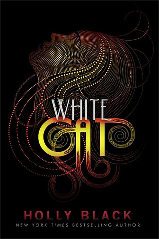
White Cat by Holly Black actually the whole series. I adored the first cover and the books and then Simon & Schuster made this disco ball 70's theme with the series and all I want to do is vomit!
#2

Across the Universe by Beth Revis. I adored the very first cover! This series has had so many makeovers I actually got whiplash!
#3
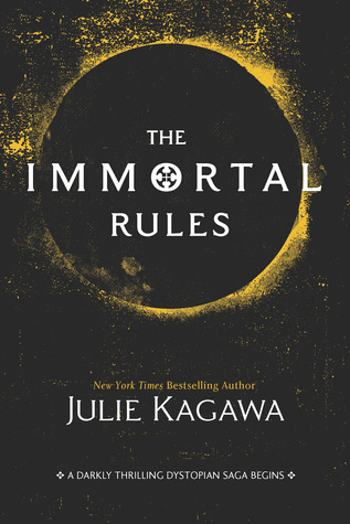
The Immortal Rules by Julie Kagawa. Another series I love and I loved the original cover!
#4

Crewel by Gennifer Albin. I loved the original cover it was so vibrant and colorful!
#5

#6
#7

Stolen Away by Alyxandra Harvey. This book was an ok read but it did deserve a better cover. They tried with the paperback edition and it is a bit better. But still not great.
#8
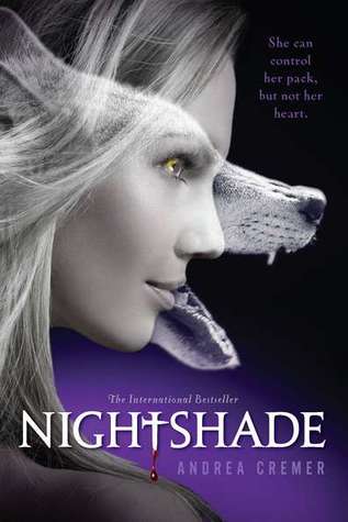
Nightshade by Andrea Cremer. I really, really loved the first cover and this was an epic fail in redesigns.
#9

Delirium by Lauren Oliver. Hated this revamp the original was soooooooo much better!
#10

The Hollow by Jessica Verday. I actually still have this one on my bookshelves and it reminds me of the Pretty Little Liars opening scene she looks like a doll. I also have the new paperback that was for once in my opinion the right redesign from Simon & Schuster.
So what do you think? Do these make you cringe as much as me? Let me know!
This was kinda fun I may have to do Top 10's more often!
Credit on the first Top Ten! I'm seeing some repeats with this week. But overall, I'm happy to see a lot of lesser popular books.
ReplyDeleteI could not agree more about Nightshade. I don't know what they were thinking, and I haven't heard of a single person who liked the redesign.
ReplyDeleteI'm not a fan of the Crewel cover, new or old. I think it needs to be redesigned again. They're just not getting it right. At all.
ReplyDeleteAly @ My Heart Hearts Books
My TTT
Ugh, some of these are just not good. I really think someone should be hired to smack the people in charge covers when a) they want to put out bad ones and b) want to change covers that are already stunning. Nice list!
ReplyDeleteRachel @ Beauty and the Bookshelf
Crewel really did have a great cover, and Nightshade was one of my favourite's until the redesign.
ReplyDeleteGreat list :)
My TTT
I agree with your utter fail on the Born Wicked redesign. Actually on the Across the Universe redesign too. In both cases, the original was so gorgeous and fit the story perfectly. So disappointing.
ReplyDeleteTTT @ Krista's Dust Jacket
The original covers for Across the Universe and Delirium are actually gorgeous, don't know why they had to redesign it :(
ReplyDeleteMy TTT :)
Eurgh I hate when they revamp book covers, but do them way worse than the originals. My TTT.
ReplyDeleteI agree with most of these! Why don't they leave those lovely original covers alone!!!
ReplyDeleteCongrats on doing your first TTT list! I agree with a lot of your picks. Delirium had a great cover that would have worked perfectly for both hardcover and paperback. They shouldn't have changed it. I guess they wanted to appeal to the YA audience more, but pictures of faces on covers tend to bore me.
ReplyDeleteCheck out my TTT list: http://www.booksavvyblog.blogspot.com/
haha!! I'm seeing a trend here. I really wish publishers would just leave the damn covers alone. And holy crap, that is yet another across the universe cover? I have not yet seen this, and I love that series. I was pissed off when they changed it the first time. ugh.
ReplyDeleteWhite Cat is a hot mess. I have the original and I didn't even it got redesigned.
ReplyDeleteCheck out Our TTT
Doris @ OABR
Wow those are some bad redesigns!! I like the original cover of Delirium way better. The color on it is so eye-catching. And that Nightshade book is just terrible. TERRIBLE!
ReplyDeleteThanks for stopping by My TTT
Oh your number one would be my number one if I participated this week. I bemoaned that cover change when I first heard about it. Such a mistake. Those other covers were awesome and the disco cheese that became this series - which had nothing to do with the story are a hot mess.
ReplyDeleteI'm almost the same with the Shade series covers. Also very 70s/80s feel. Those original covers rocked. I don't dislike the covers for Born Wicked and Star Cursed but that original BW cover was absolutely stunning.
And I'm totally with you on the Nightshade covers. While a couple of them I don't mind, I freaking loved the original Wolfsbane cover. I stare at that ARC as it's one of my favorite. LOL I think I have that original cover on my twitter background.
Great picks. Trying to think if there were any others I didn't like, can't remember... Usually just remember the ones I love.
I really loved the first covers of the White Cat series too! They were perfect and all gangsterish. I really miss them!
ReplyDeleteI liked the original cover of Crewel too, although I haven't read the book. It looks pretty good, though! :)
I liked the originals of Shade too! I actually think that the cover model on the new ones is kind of making a creepy face. O.O
Born Wicked looks so good! I really want to read it - but I liked the original cover as well. It was kind of creepy, in a good way. :)
Delirium. MEH. I liked the original better - it was cool how you could see a face through the text. :) Here's to hoping Simon & Schuster will stop redesigning - they fail at it! O.O Awesome post. :)
Wow to Nightshade *scratches head*
ReplyDelete